Use Case 2. Pick One (Radio Buttons) question with across answer choices position
Issue
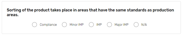
This use case demonstrates how you can improve look and feel of the Pick One (Radio Buttons) type of question with the 'across' answer choices layout. Example is shown on the picture below:

Solution
There are 2 ways how the appearance can be improved in this case:
Align the answer options to the left;
Align the answer options to the center;
On the survey Edit Layout>CSS page add one of the following pieces of code:
Left alignment:
.aDivQuestion_Qxxx.subTypeAccross .H3 {text-align:left !important;}
OR
.aDivQId_questionIdentifier.subTypeAccross .H3 {text-align:left !important;}
Central alignment
.aDivQuestion_Qxxx.subTypeAccross .H3 {text-align:center !important;}
OR
.aDivQId_questionIdentifier.subTypeAccross .H3 {text-align:center !important;}
where: .aDivQuestion_Q and .aDivQId_ | reference to the particular question; |
|---|---|
XXX - | question sequence number; |
.H3 - | represents answer text parameter; |
text-align: left | aligns answer choices text to the left; |
!important - | means that text alignment of this particular item has an advantage over other text alignments indicated in other classes. |
Result
When given CSS code is applied, your survey question will look as follows:
Left alignment:
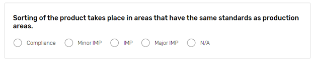
Centeral alignment