Use Case 3. Horizontal and vertical appearance of the Matrix question items
Issue
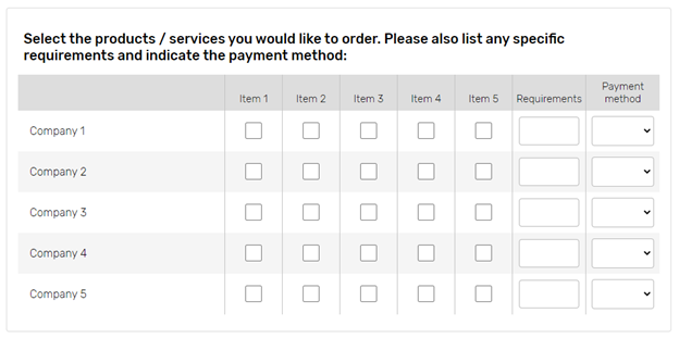
In this use case, we will show how to improve look and feel of the Matrixquestion. This type of question may have inaccurate appearance due to the variety of scale elements. The example given below shows that question is stretched through the whole screen and answer choices are clustered together which may affect respondents perception.

Solution
On the survey Edit Layout>CSS page add one of the following pieces of code to improve question appearance
.aDivQuestion_Qxxx .HRG3D {width:4% !important}
/* to decrease horizontal space and make question more compact;*/
.aDivQuestion_Qxxx .H4 {padding:10px 0px}
/*to enlarge vertical space and make answer choices more readable. */
OR
.aDivQId_questionIdentifier .HRG3D {width:4% !important}
/* to decrease horizontal space and make question more compact;*/
.aDivQId_questionIdentifier .H4 {padding:10px 0px; width:5% }
/*to enlarge vertical space and make answer choices more readable. */
where: .aDivQuestion_Q and .aDivQId_ | reference to the particular question; |
|---|---|
XXX - | question sequence number; |
questionIdentifier | question custom identifier; |
.HRG3D - | represents question cells per all answer choices and scale items; |
width:n% | decreases cells to the specified width; |
!important - | means that the text alignment of this particular item has an advantage over other text alignments indicated in other classes. |
Result
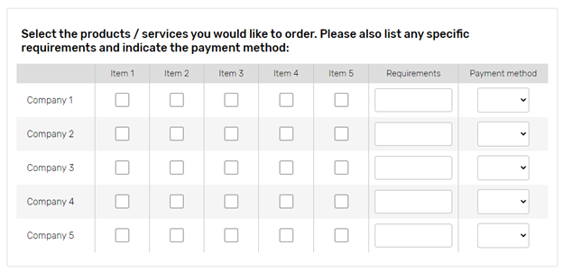
As a result, the 'Matrix' question will look as follows:

