Chart Design Tab
The Design tab is located on the Edit Chart panel. You may access it while creating or editing one of your Charts. The available Design options depend on the Chart or Table type, as well as the combination of dimensions and calculations in the chart data.
Chart Design settings override Dashboard Design settings.
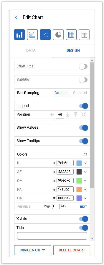
Chart Title and Subtitle
On the Design tab, you can activate/deactivate both the Title and Subtitle. Once activated, you can add text and set the text alignment:
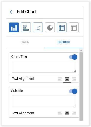
The Chart Title and Subtitle are limited to 150 characters including spaces.
Bar/Line/Slice Colors
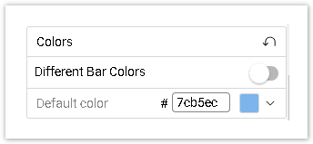
If you would like to apply individual chart colors instead of using Dashboard colors, you may do it in this section. You will see and be able to choose as many individual colors as there are unique bars/lines and slices in your chart.
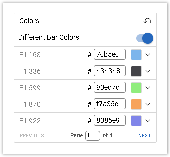
If your Bar chart consists of one dimension and one calculation only, by default all bars will be displayed in the same color:
For such charts, there will be an additional setting which will allow to keep using one default color, or activate Different Bar Colors:
Bar Grouping
This setting is available only for bar charts with two dimensions and one value.
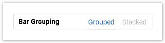
The Grouped option is the default one.
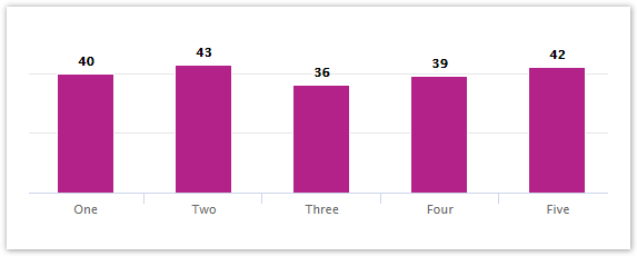
Show Values
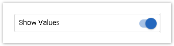
Activate this option if you would like to see calculated values in your chart:
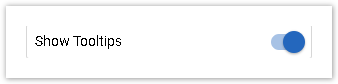
Show Tooltips
Tooltips are displayed when hovering your mouse over a bar, slice, or point on the line or a table cell, with information about the dimension name and value.
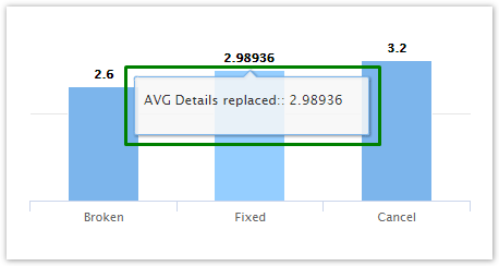
If you would like to see these tooltips, activate this option on the Design tab:
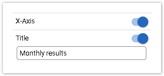
X-Axis
This setting allows to show/hide X-Axis on your chart, and is displayed only if a Bar/Line Chart has at least one dimension.
Additionally, you may enable and add a Custom Title which will be displayed below the X-Axis. The Title field is limited to 50 symbols.
Y-Axis (%)
This setting allows to show/hide Y-Axis on your chart.
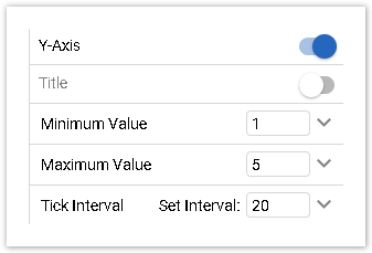
Additionally, you may enable and add a Custom Title, specify the Minimum/Maximum value and set a Tick interval. A custom title will be displayed near the Y-Axis. The Title field is limited to 50 symbols. The default Minimum and Maximum Value is auto, but you may input any number with which the axis should start and end.
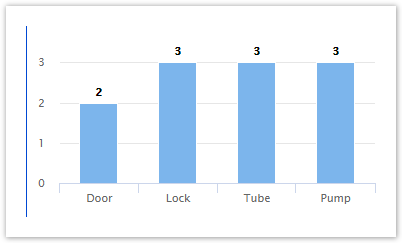
The Tick interval can also be changed if needed. For example, this is the graph with the Auto tick setting, which appears to be 1:
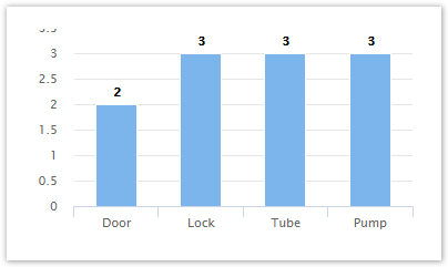
If we change the Tick interval to 0.5, the graph will look like this:
Scroll
Sometimes in Charts X-axis may have a lot of categories which don't fit into the chart width. Then you may enable the Scroll option on the Design tab.
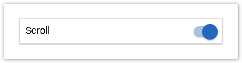
Please note that vertical and horizontal scroll options will appear for those types of bar charts.
Display points
This setting appears for Line Charts only.
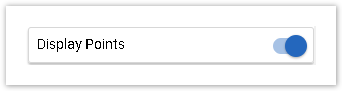
Activate it if you would like to display points on the lines, along with the values. If this option is disabled, points will still be displayed on hover.
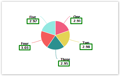
Show labels
This setting appears for Pie Charts only.
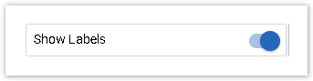
When this option is on, answer labels will be displayed next to each slice.
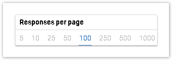
Responses per page
This setting appears for Tables only and allows to determine how many responses are displayed per page in your Table:
Design features available for each Chart and Table type
Chart type | Chart Title | Subtitle | Bar/Line/Slice Colors | Bar Grouping | Show Values | Show Tooltips | X-Axis | Y-Axis(%) | Scroll | Display points | Show labels | Responses per page |
Vertical and Horizontal Bar | ➕ | ➕ | ➕ | ➕ (charts with 2 dimensions and 1 value) | ➕ | ➕ | ➕ | ➕ | ➕ | ➖ | ➖ | ➖ |
Line | ➕ | ➕ | ➕ | ➖ | ➕ | ➕ | ➕ | ➕ | ➕ | ➕ | ➖ | ➖ |
Pie | ➕ | ➕ | ➕ | ➖ | ➕ | ➕ | ➖ | ➖ | ➖ | ➖ | ➕ | ➖ |
Crosstab | ➕ | ➕ | ➖ | ➖ | ➖ | ➖ | ➖ | ➖ | ➖ | ➖ | ➖ | ➖ |
Table | ➕ | ➕ | ➖ | ➖ | ➖ | ➖ | ➖ | ➖ | ➖ | ➖ | ➖ | ➕ |