Line Chart
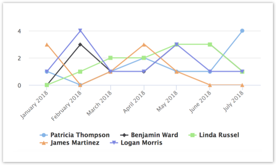
This type of chart displays series of data points connected by straight line segments. Each data point on the line represents a calculated value and multiple lines represent either multiple dimensions or values, depending on the chart settings. The Line chart is best suited for displaying data trends over a period of time.
To create a Line chart, add values and dimensions from the Data Source tab by dragging and dropping them to the corresponding fields of the Edit Chart Panel:
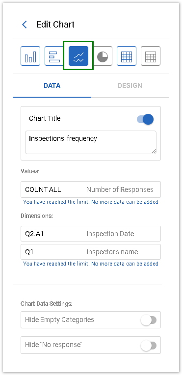
Values and Dimensions Settings
The Line Chart a maximum number of data points is limited to 10 000 unique values.
The Line Chart is limited to either multiple values with one dimension or 1 value with 2 dimensions.
The Line Chart supports the following combinations of Values and Dimensions (Show by):
Number of | Number of | Result | Line Chart Example |
1 | 0 | One point is drawn |  |
multiple | 0 | One point is drawn for each value |  |
multiple | 1 | The dimension is used to generate the X axis |  |
1 | 2 | The first dimension is used to generate the X axis. |  |