Question Graph
The Question Graph feature allows viewing a report question graph by clicking the graph icon next to the question on the Report Itemspage.
You may customize your question graph by adjusting the following options:
Graph type Allows you to select various types of diagrams or disable graph per each report item so your report displays pure data only without graphical representation.
To display your survey results more precisely and extensively, different graph types calculate percentages in different ways for multichoice types of question (Check All That Apply and List Box):
Bar graph provides the percentage of the number of times an answer option was chosen, from the number of respondents for the question in general.
Pie chart calculates the percentage of answer options from the total number of answers selected for this question (total=100%). Please note that calculated results may be truncated and total may be equal to 99%.
Graph Appearance
Width Indicate width of your graph in pixels.
Height Indicate height of your graph in pixels.
Graph Alignment You can align the graph above, below, right, left or just inside the graph table area.
Scale and Captions
totals Select this option to scale the diagram in units corresponding to the total amount of respondents having selected certain answer choice.
percent Use this option to scale the diagram in percent.
Show Captions as Legend Captions will be displayed below the graph, designated with different colors.
Show Captions as Labels Captions will be displayed next to each graph element.
Graph Options
Show question in title Select this option to display the question text in the title of the diagram.
Rank in order Arranges all items in descending order.
Zoom in Select this option show the area with the informative data only.
This option is applicable when scaling the diagram in percent.
Show axis labels You can give names to the graph axis instead of the default names.
Show values next to bars This option shows the value of each graph bar next to it.
Show threshold values If you have a threshold value for the collected data and want to compare collected results with this value, select this option and indicate threshold value. Thus you will see how the collected data differs from the data you expect to see.
Customize Colors
Here you can customize your graph colors for better data appearance. Next to each answer choice click the color-picker icon to select its color within the graph. You can select predefined colors, indicate the color you need in hexadecimal format or switch to the advanced mode to indicate color in RGB or HSB format. If you want to save picked color, just retrieve the hexadecimal code for this color and then use it within the other questions and graphs.
Pie Charts have additional options that make your graphs more informative and professional:
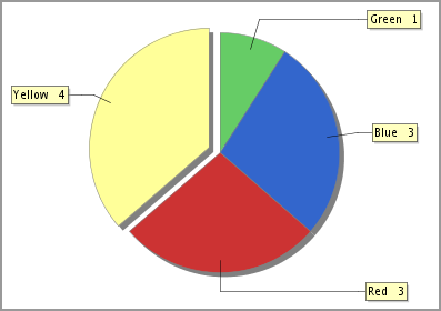
Show Legend - this option shows which color of the pie chart corresponds to the selected answer choice.
Exploded - this option is used if you want to single out particular answer choice from a pie.
ℹ️ Example:

Export to PowerPoint
Move mouse over graph when preview the report.
Right click.
Select Copy.
Open the PowerPoint document.
Right click on the PowerPoint page.
Select Paste to paste the picture.
