Edit Tab
Edit tab gets activated when you click on any form element in the structure tree or on a working field. The functionality in this tab provides for editing form components.
If you click on a particular question in the left pane, the Edit tab of the ribbon toolbar will have the following look:
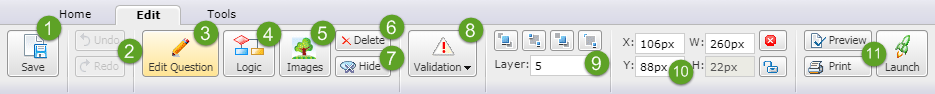
The Save button (1) serves for saving changes made to the form.
The Undo button allows you to revert the last changes applied to the form one at a time, while the Redo button applies the undone changes back (2).
Edit Question (3) opens up a page for editing the particular question type you have selected. To read more about creating and editing questions of different types, please consult our Question Types section.
The Logic (4) button is used to configure logic for your form. Unlike logic in a survey, form logic works on a per-page basis. It cannot be pointed to a specific follow up question and is instead pointed to a later page. Therefore, you should locate your questions on separate pages if you wish to set up logic for your form. For further guidelines on setting up logic, please refer to Logicsection.
The Images(5) button serves for adding images to your form questions and answer choices.
Use Delete (6) to delete a question and Hide (7) to hide it from respondent’s view. This is commonly used if you autofill respondents' data into a hidden question for reporting purposes.
The Validation button (8) can be used to configure whether a question is obligatory to answer. More about validation can be found in the Question Setup section.
The controls of the Layer section (9) are used for adjusting the overlapping of grid elements (placing one element on top of another). The four buttons from left to right are:
Bring To Front - brings the form element to very top of the stack.
Send To Back - sends the form element to the bottom of the stack.
Send Backward - moves the form element down one level in the stacking order.
Bring Forward - moves the form element up one level in the stacking order.
You can also change the value in the Layer box to move an element a desired number of layers forward or backward in a single action. Another way to access this functionality is to right-click on a form element located in the grid.
Every element on the grid has its own coordinates, size and position. While the size of an element can be changed by dragging its handles, you can be more exact by using the W and H boxes (10) to change the width and height, respectively. Similarly, you can use the X and Y boxes to change the position of an element on the grid, allowing for pixel-perfect placement. Use X to specify distance, in pixels, between an element and the left edge of the working area that contains it, and Y - between an element and the top edge of the working area. The X, Y, H, W properties are automatically updated when you move or size an element.
The Lock button will freeze the selected element in place so it cannot be accidentally moved or re-sized. The color of its handles will change to red to indicate this. This can be done with multiple elements at once by selecting all of them before locking. The Attribute Default button can be used to set the selected element to its default size and shape, depending on its type and contents.
The last section (11) features the Preview button for previewing the form, the Print button for printing it out, and the Launch button for launching the form.
If you click on a form header or footer in the left pane, the Edit tab will also contain a section with functionality similar to the one of the WYSIWYG editor.